What you'll find in this section
Data about
- Homeownership rates by
neighborhood and race - Mortgage applications by race
- Income and education by race and
gender - Labor statistics by race and gender
Key Findings
- In Vanderburgh County, homeownership is 70% among white residents but only 28% among Black residents. It has grown to 50% among Latino residents.
- People of color participate in the labor force at a higher rate than white residents, but Black workers are twice as likely to be unemployed and Black households have about half the income of white households.
- The labor force gap is closing between men and women, and women are more likely than men to have a college degree. Still, women only earn 65 cents for each dollar men earn.
Where you live matters
This map from the Home Ownership Loan Corporation was developed in 1937 to grade neighborhood characteristics. Similar maps were used by the Federal Housing Authority to determine where federally-backed mortgages would be originated. These maps created “redlining,” designating certain neighborhoods as too “risky” for mortgage guarantees. Read inside to learn how these neighborhoods are still impacted by low homeownership rates and high rates of loan denial.
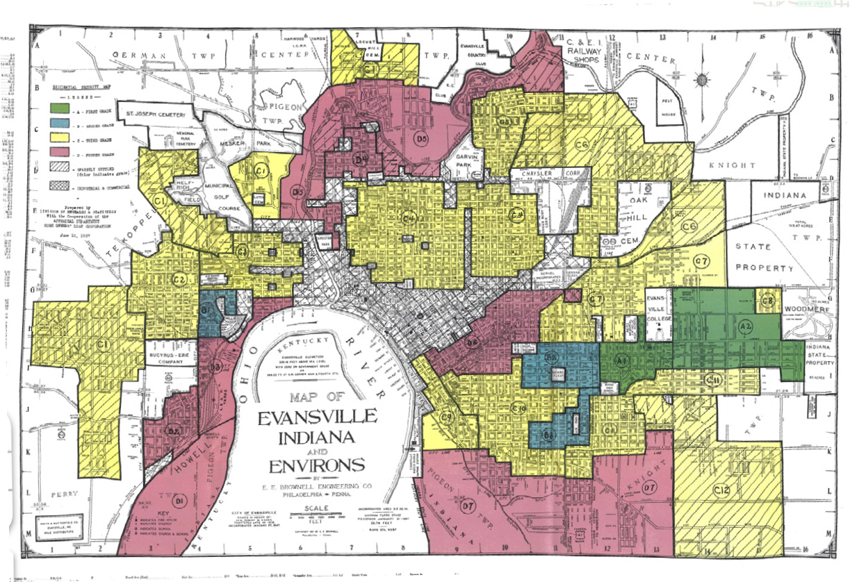
Source: University of Richmond, Mapping Inequality
This chapter explores equity from the point of view of the historical practices and systems that helped generate current socioeconomic divides in our community.
Redlining and Homeownership
In 1937 the Home Owners Loan Corporation assessed neighborhood conditions in cities across the country. Neighborhoods were graded from A to D. Later, the Federal Housing Authority would use similar maps and neighborhood grading to determining underwriting qualifications for federally-backed mortgages, meaning people applying for loans in poorly graded neighborhoods had a harder time accessing the substantial credit that vastly expanded homeownership in the middle of the 20th century. Lacking access to credit, Black households also lacked access to an opportunity to grow generational wealth. White households were 10 times wealthier than Black households in 2021, according to the U.S. Census Bureau.
While these maps and the process of neighborhood grading did not cause segregation, it sometimes helped perpetuate it. The neighborhoods graded D (or “redlined”) still have dramatically lower homeownership rates in Evansville. According to University of Richmond’s “Mapping Inequality” project, “By the turn of the twentieth century, Evansville had the second largest population of African Americans in Indiana. Segregation in this city predated redlining.”1 A principal early Black settlement was Baptisttown* centered on Canal Street. Today this area has a 4% homeownership rate. Further northeast along Canal Street, the Old Erie neighborhood has a 23% home ownership rate.
On the other hand, Lincolnshire and University South, which were graded A in the 1937 maps, have a 93% homeownership rate. These maps show us that much is unchanged in the segregation of American cities and the exclusion of Black Americans from affordable credit.
* known today as Center City Improvement Association (CCIA)
Homeownership is climbing among Latinos but falling among Black residents
Percent of each race that owns their home, Vanderburgh County

Source: American Community Survey 5-Year Estimates
Black mortgage applicants make up one in twenty of applicants, denied at twice the rate of whites
Mortgage application statistics by race of applicant Vanderburgh County, 2022
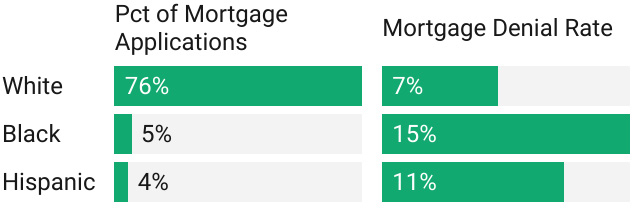
Source: Home Mortgage Disclosure Act
For comparison, Black residents are 10% of
Vanderburgh County
How do redlining maps compare to current homeownership rates?
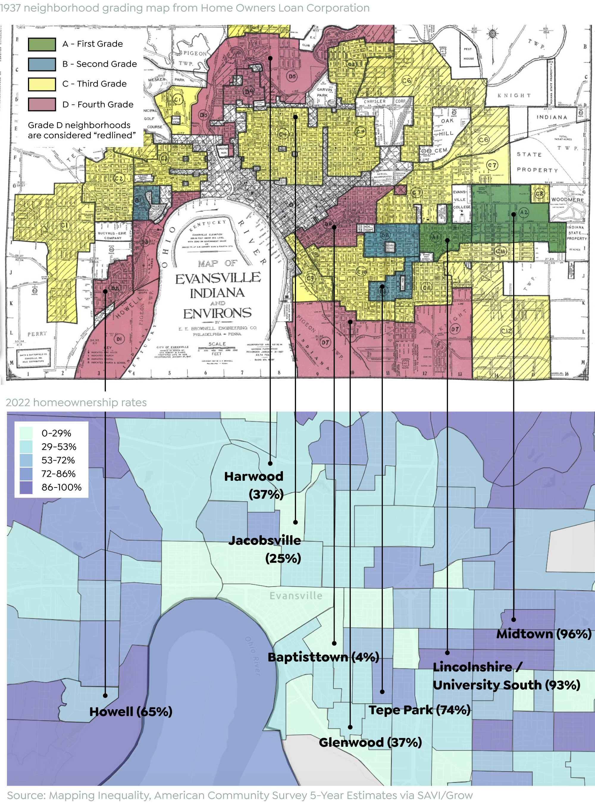
Click here to explore map in SAVI
Economic Opportunity
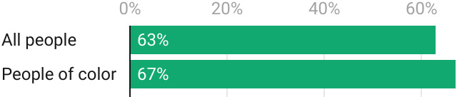
Two-thirds of people of color participate in the labor force, which is higher than the overall rate (63%). Still, the median household earnings for Black and Latino residents are far lower than for white residents. One driver of this difference could be unemployment rate. Between 2018 and 2022, the unemployment rate for white residents averaged 3.2%. The rate is 7.4% for Black workers, more than twice as high. It was actually lower for Latinos (3.3%). Unemployed workers are part of the labor force and actively seeking employment, but do not currently have a job.
Educational outcomes also contribute to earnings potential. Median earnings for an individual in the Greater Evansville Region with a bachelors degree total $55,500 but are only $36,400 for people with just a high school diploma. This relates to race because 27% of white residents have a bachelor’s degree but only 21% of people of color.
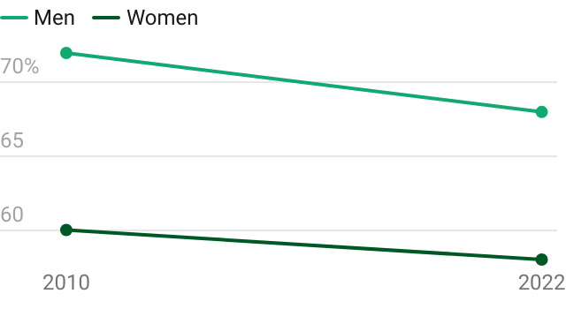
When examining trends by gender, the labor force participation gap is closing between men and women but only because it is falling for men. In 2010, 72% of men age 16 or older participated in the labor force. This has fallen to 68%. The rate for women fell from 60% to 58%.
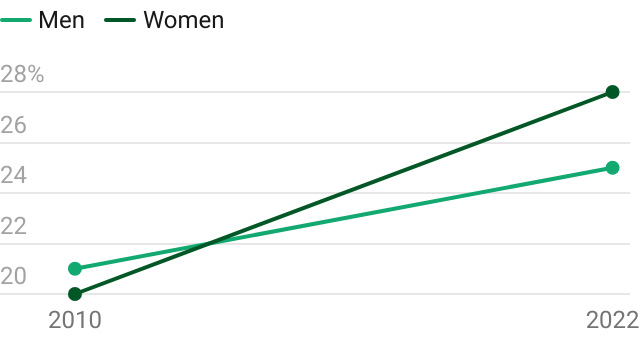
An increasing share of men and women have a bachelor’s degree, but the increase is fastest for women. Women have actually overtaken men in educational attainment: 28% have a bachelor’s degree compared to 25% of men. The difference is not large, but the trend is significant given historical differences in educational attainment for men and women. This has helped improve the pay gap for women from 63 cents on the dollar to 65 cents on the dollar, but still, men earn a median of $48,900 while women earn a median of $32,000.
For more detail about socioeconomic status by race and gender, see the “Socioeconomic Status” chapter.
People of color earn about half of what white residents earn, though they participate in the labor force at a higher rate
Median income by race, five-county region, 2022

Labor force participation rate, 2022
Source: American Community Survey 5-Year
Estimates
Labor force participation rates are falling for men and women, falling fastest for men
Labor force participation rate (of population 16+)
Women now attain bachelor’s degrees at a higher rate than men
Share of population with a bachelor’s degree
Source: American Community Survey 5-Year Estimates
Notes
- Nelson, R. K., Winling, L, et al. (2023). Mapping Inequality: Redlining in New Deal America. Digital Scholarship Lab. https://dsl.richmond.edu/panorama/redlining.
Where You Live Matters is a product of Grow
in partnership with The Polis Center.
Guide